Lesson 01 - Visualization Fundamentals
What is data visualization
- conveying a story or idea as efficiently as possible
- a picture is worth a thousand words
- how best to represent visually underlying data using color, size, shape
- mapping values to visuals
- instead of looking at columns of data we can looks to bars, lines, graphs of different colors
- turning numbers into pictures and stories
- our visual systems are much faster in processing the information
Good Data visualizations
Exploratory
- trying to find insights - what the data is, what can it tell you
- turning 100 rocks to find 1 or 2 good nuggets
- connect things in interesting ways
- look at the data from different angles
Explanatory
- after finding something to share
- 5 keys
- robust understanding of the context
- who your audience is
- what they need to know or do
- choose appropriate type of visual
- what do you want your audience to do with the information
- what kind of graph would allow them to do that in most easy and straight forward way?
- taking care of clutter
- things that do not add value, information to our visuals
- decreases cognitive load and causes our data to stand out more
- drawing audience attention towards what you what you want
- color
- size
- placement on page
- story
- robust understanding of the context
Alberto Cairo's Three Steps to Become a Visualization Designer by Andy Kriebel.
Slope Graphs
Click the following link to view an image of the slope graph.
Words of wisdom from Zipfian Academy
- about background of students and what it takes to be successful with data visualization
- students focus too much on complex analysis or optimizing some model without thinking about the larger process as a whole
- tell students that their greatest insight is only as good as your ability to communicate it
- if we spend time on optimizing without thinking how someone might derive value from it then it is useless
- data visualization is both art and science. students need to know programming but they also need to have a sense of visual design and storytelling
Advice for beginners
- the time is great as the field is expanding
- there is no one place to get all that information
- leverage your background knowledge
Data Visualization and you
- designer, enginner, storyteller - they are great entry points for learning about and creating data visualization
Data Science Process
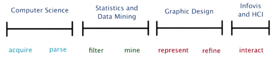
- first
- Data wrangling
- takes most time
- data ingestion, ETL pipeline
- second
- EDA
- filtering and mining
- many consider most exciting
- modelling, data mining and exploratory data analysis
- many people consider where magic happens
- third
- Data visualization
- visual representation of data and how it is presented
- experiment with various visual encoding
- last
- how reader may interact with your visualization
- information visualization and human computer interaction
- enable users to discover insights for themselves
Explanatory vs Exploratory
- Data visualization happens between the data and user when you are trying to prove something
- EDA happens between data and you when you are trying to find something
Alberto Cairo discusses the purpose of Infographics and Data Visualizations on his blog, The Functional Art.
Stephen Few discusses the difference between Data Art and Data Visualization on his website, Perceptual Edge.
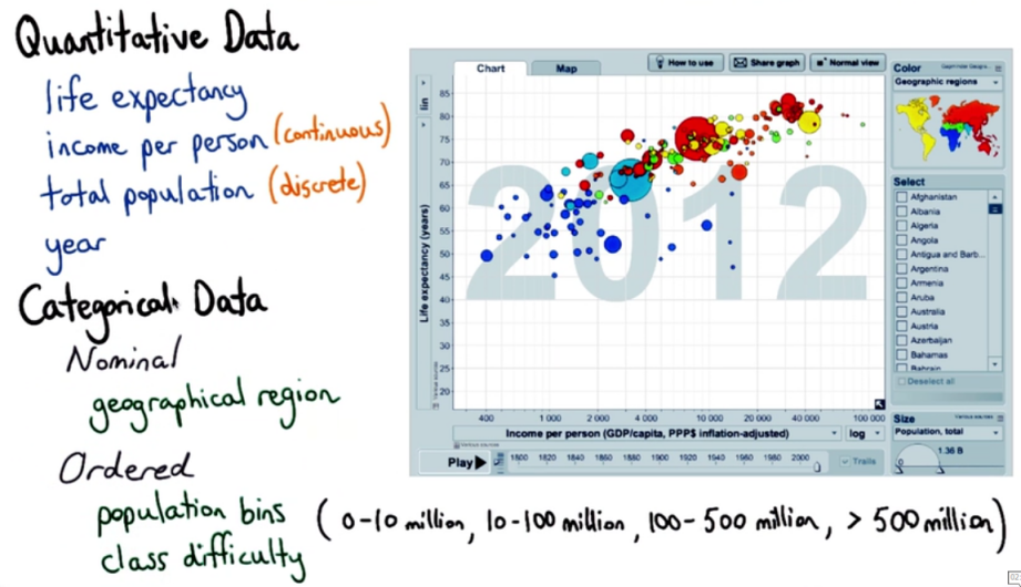
Data Types and Data
Hans Rosling’s 200 Countries, 200 Years, 4 Minutes https://www.youtube.com/watch?v=jbkSRLYSojo
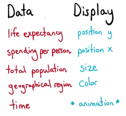
Healthcare spending and life expectancy from OECD Health Data 2009
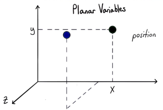
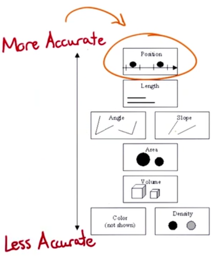
Visual Encodings
Displaying 2 variables by x and y axis is easy. But things become complicated when we need to add more variables
Planar Variables
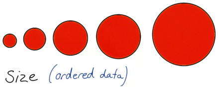
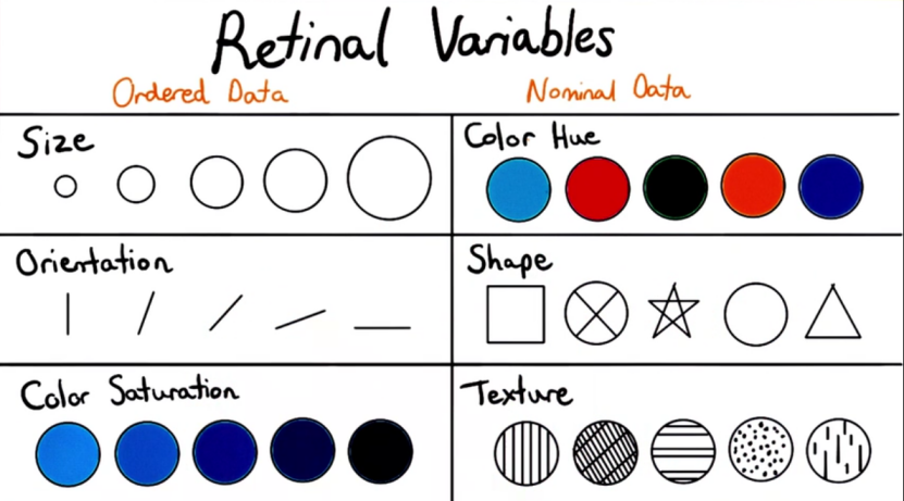
Retinal variables
Gapminder World visualization https://www.gapminder.org/tools/
Facebook Offering
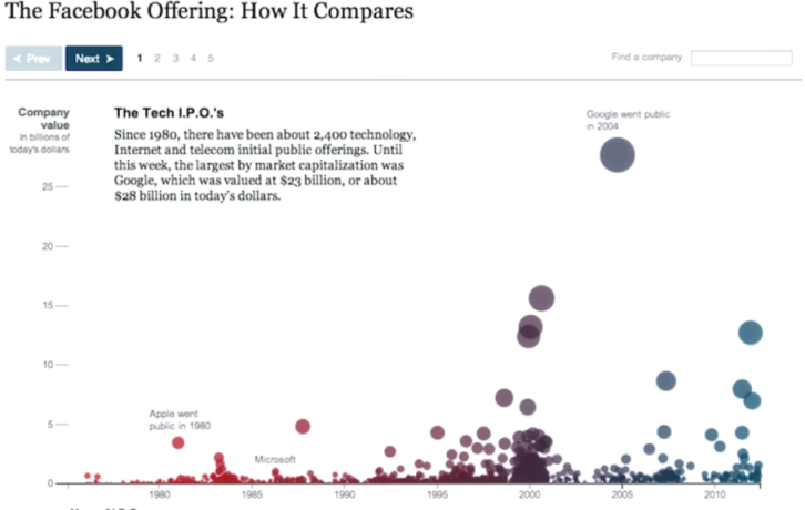
Double encoding has been used
- size and y position for the value of the IPO
- color and x position for the year when the company went for IPO
opacity is another visual encoding that was not mentioned earlier and can be useful
The animation needs to be seen from the link. Helps get a sense of how great it was.
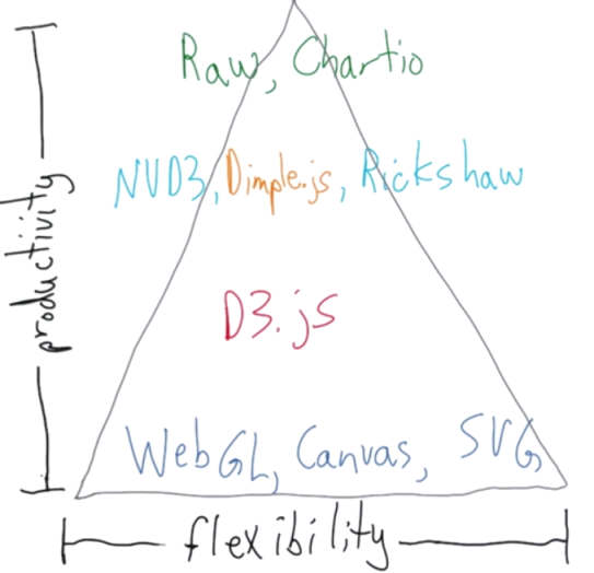
Up and Down the Visualization Spectrum
- At the bottom of the spectrum we have
- WebGL
- Canvas
- SVG
- These are
- efficient, performant
- flexible
- low level
- hard to develop with
- A level above we have d3.js
- built on top of open web standards - JS, HTML, SVG, CSS
- Built on top of d3.js are many libraries. Some of most common are - NVD3, dimple.js, rickshaw
libraries built on top of d3 fall into 2 categories
- high level charting libraries
- specific type of data e.g. rickshaw was built to easily show timeseries and realtime streaming data
At the very top of top of spectrum we have raw or chartio that have graphical interfaces to built graphics
- only have predefined charts